UX Talking Points is a conversational interview series where our subject chooses four topics to discuss within the context of design. This week we interviewed - Ario Jafarzadeh. Ario's worked as a UX designer since 2001 at companies like Microsoft, Google and Amazon. He's passionate about using design to promote greater human flourishing and well being. He's also a fan of sushi, old video games, and menswear inspired womenswear.
Topic 1 - A Concept: Mindfulness
You chose Mindfulness for our first topic. What made you think of that?
One parallel I like to draw from much of the time is food. Like design, it’s something that’s important to be mindful of.
So, is design similar to cooking for you?
Yea, for sure. We had this explosion of fast food and cheap foods becoming really prevalent in the 1980s and 90s and now we have things like the slow food movement and food trends like paleo, which is eating fewer carbs… but, basically all these things point to mindfulness. People are trying to be more careful about what they are putting in their bodies. And, what about the virtual stuff we all put in our bodies? I would describe our current virtual structure as the equivalent of being immersed in McDonald’s french fries. There are evolutionary reasons why you want it. If you came across something that was rich in fat and salt, that might be something that could sustain you for a long time. We have an evolutionary need for gossip, drama, ect.
"I would describe our current virtual structure as the equivalent of being immersed in McDonald’s french fries."
Mostly this is what we find through our social media channels. You can go out of your way to not look at that stuff, but the systems certainly don’t bias away from it.
Are people going to just simply want the ‘junk food?’ Or, is there a desire for something more meaningful in the digital world like there is with the slow food movement?
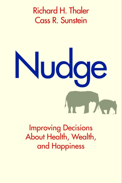
 People are always going to want junk food. And, you can’t diminish those desires. And, I would never want to say that we should ban those things. But, I think a good parallel is Nudge - a book by Richard Thaler - he’s a behavioral economist. He talks about cafeteria lunch lines - it’s an ecosystem that someone else has designed for the child, but the child has some degrees of freedom. They can choose what to put on their plate. So many public schools may put what the kids want first: the square greasy pizza, the french fries. But, what they talk about in the book is that if you can get them to put the salad first, and actually put some decent options in the salad bar and then put the unhealthy choices later, the kids will choose those healthier options. As designers we’re trying to make intelligent choices on behalf of our user.
Topic 2 - A Method: Exploratory
Exploratory is an interesting method because it’s something that can be greatly needed by some people and averted by others. Can you talk a bit about that?
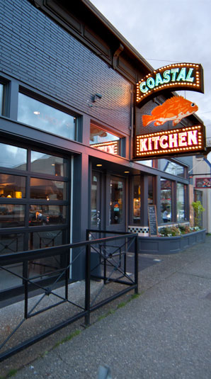
Exploratory points to something else I wrote down - the concept of delight. If i’m in an environment like a restaurant or bar - I would consider going into the bathroom an exploratory experience. It’s sort of not somewhere you set out to go to,  but let’s say you go to a restaurant’s bathroom and some element of the restaurant’s vibe is carried over in the experience of the restroom. For example: Coastal Kitchen, in the Capitol Hill area of Seattle, usually has themes incorporated into the menu like Moroccan food. And, if you go into their bathroom you’ll hear an audio cassette playing of how to speak Moroccan. It’s like continuing that user experience of the menu into the bathroom in a delightfully unpredictable way. Exploration and delight really go hand in hand. In the digital realm when you used an iPhone for the first time and you went beyond the bounds of the email list and it would snap back at you and have physics to it - that’s exploratory.
"Exploration and delight go hand in hand."
Nobody told you that, there was no line in the manual that said - hey to see this funny little animation do this thing. You just discovered it on your own. It’s very organic and it makes you feel like you’re in a world that mimics what the physical world is like. And, the physical world is very exploratory.
Exploration seems like a pretty hard element to work into a design.
It is. Especially when 99% of projects you’re working on the budget and resources are constrained, and you’ve got an aggressive timeline you’re trying to hit. But, somehow startups manage to do that. And, I would say that the ones that take off, or at least the ones that have the greatest amount of users are the ones that put enough stock in those kind of things. People see that stuff and it just makes the app more pleasurable to use. It works on an unconscious or subconscious level.
Topic 3 - A type of style: Classic / Timeless
The web isn’t something where typically past aesthetics have been revered. Will there be classic elements of the web in the future?
It’s interesting. I don’t know if the internet is like that. There are certain things like... maybe you could call an email application the equivalent of a good old knife.  You’re not really trying to think about your email, you’re just trying to get it done and move on with your life. Certain apps you don’t want to have a big personality, you just want it to fade into the background. I firmly believe that most of the services we commonly use like Facebook and Twitter are ripe candidates for getting facelifts to their designs. And, it’s up to the designers to think about what are going to be the things that fit into that narrow bandwidth of changes that are not going to materially mess up the experience. It takes a bit of growing pains to get your head around.
"you have to find the goldie-locks zone"
People will get accustomed to something the way it was and then have an allergic reaction to the new one. It just falls on the shoulders of these companies to not let their users hold them hostage, but not be so rigid that if it’s a clear screw up that they don’t go and do something about it. There is a sweet spot - you have to find the goldie-locks zone.
You’re saying that the functionality of a good product more or less stays the same, but you want to push on those functionalities where they matter?
Right, and you can eschew that - you can completely ignore that. And, I think the best example is Facebook with Paper. You can have a parallel track of development and say, we’re going against the wall - that has our been our bread and butter since our inception - and think of a different model. We’re (Facebook) going to take a queue from Flipboard and try to make this into a news reading experience on top of what we have and just see what happens. And, I really applaud that. The biggest blind spot that all of the big companies have is not having a labs. Having a place where you don’t have to screw with your bread and butter user and then giving the people that are the most passionate about what it is that you do to play with your new ideas. Then filter the best parts of those new ideas back into the main product - it’s genius.
Topic 4 - A situation, place or time: Forest
You mentioned forests and couches here. It seems we have our best ideas in a comfortable relaxing place like a shower or forest ect.
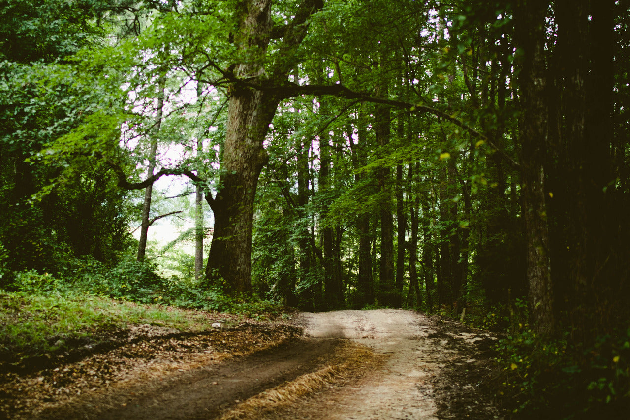
Edward Tufte speaks of the New York Times site as being similar to standing in a forest. There is tons of information there and different things to look at. And, you have to be the one to make the choice of where to focus your attention. But, there is order to it, the same way that there is order in nature. Many people think good design is synonymous with simplicity which many have come to associate or equate simplicity to mean barren or ascetic or like a hospital - sterile.  Not too much going on. But, I think that humans often have an adverse feeling to this. Look at an insane asylum - like the padded room for instance - it’s just a white room. Stanely Kubrick used environments like that in 2001: A Space Odyssey to make his audience feel unsettled. It’s why that if you look at a good interior design they try to bring plants and things.
Google is known for their beautiful offices - they bring outside elements inside to make you feel at home. It goes back to the nature thing we were talking about. When you share a room with your coworkers and you can have your own music playing - even if the other guys don’t listen to the same kind of music - it still engenders camaraderie. And, camaraderie means you can communicate faster and you trust each others decisions and you just move quicker. This is why startups have been able to disrupt some of the big players in the market. There will never be a substitute for four or five smart, motivated people who have one shared vision and want to go after it. Sure they might be wrong, but they’ll learn a ton and come back and do something else.