Mike Rohde is a designer, author, illustrator and sketchnoter based in Milwaukee, WI. He’s the man behind the best-selling books The Sketchnote Handbook and The Sketchnote Workbook.

What do you do?
Primarily, I’m a user experience and visual designer, working at the small user-centered design firm, Gomoll Research + Design in Milwaukee, Wisconsin. We work with large and small companies to create useful, beautiful and functional user interfaces for applications and websites, with emphasis in financial and health care industries.
I’m the author of two bestselling books on visual thinking: The Sketchnote Handbook and The Sketchnote Workbook. I support both books by providing customized Sketchnote Workshops for colleges, universities, and businesses. I also support sketchnote community with the Sketchnote Army website and Sketchnote Army Podcast.
Finally, I’ve illustrated books, like REWORK and REMOTE from Jason Fried and David Heinemeier Hansson. I love working with authors to create images that help amplify their ideas in a visual way.

Tell us your design philosophy in three words.
Simple, useful, beautiful.
What are your tools of trade?
For Digital UI/UX Design:
My primary design tool for production is a MacBook Air, so here are the tools I use to get things done in my design work.
• Photoshop — UI Mockups, since many clients request PSD files
• Sketch — UI mockups, I’m quickly moving over to this tool
• Illustrator — Icon design and the occasional logo
• Basecamp — Managing client mockups and feedback
• InVision — For sharing design mockups and prototypes with clients
• Slack — Discussions with teammates about projects
• Ulysses — For capturing notes on projects and writing
• Things — For task management
For Analog Illustrations and Sketchnotes:
For analog illustrations and sketchnotes, which is the bulk of what I do, I use all sorts of tools. I’m always experimenting, but these are the standbys:
• Pentel Energel 0.7mm pens in black
• Papermate Flair pens in black and various colors
• Uniball Air pens in black
• Retro 51 thick lead mechanical pencils
• Leuchtturm1917 Sketchbooks
• Baron Fig Confident Notebooks (plain and dot grid)
• VectorMagic - great for vector tracing of inked illustrations
• Illustrator and Photoshop (finished illustrations and sketchnotes)
For Digital Illustration and Sketchnotes:
For digital illustrations and sketchnoting, I love my iPad Pro and Apple Pencil for their portability and precision when paired with great drawing apps.
• iPad Pro (128GB)
• Apple Pencil
• Paper by FiftyThree
• Concepts Pro
• Illustrator and Photoshop (finished illustrations and sketchnotes)

Name of the book/magazine closest to you now.
The Revenge of Analog by David Sax
What is your proudest professional moment?
Creating The Sketchnote Handbook and watching it become a best selling book, translated into five languages: German, French, Russian, Chinese, and Czech.
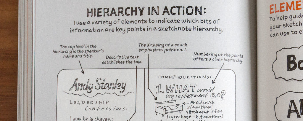
My editor Nikki McDonald, Peachpit and I worked hard to do something quite different with that book, and it paid off. We used thicker cover and interior paper stock with rounded corners; two spot colors instead of 4 color process printing; a wipe-clean, matte cover coating; use of a hand-drawn font; work from a wide mix of sketchnoters from around the world; and a fun, approachable tone for beginners.
I created a video to accompany the book with video storyteller Brian Artka, and the team at Peachpit. We worked hard to make the video approachable and fun, just like the book it was part of.
Not only did the hard work and innovative design ideas impact the book industry, it spoke to all sorts of people through the content and tactile experience of how the book itself looked and felt.
I’m very proud to have made a positive impact in the world.
What's your one UX pet peeve?
Tiny, gray, unreadable typography. I know it’s a trend to make everything small, and stylishly light gray, but I think it’s problematic for many users to read and work with tiny type. So often it’s simply a matter of style and not legibility driving the decision. There’s usually no reason the type couldn’t be larger and clearer for legibility in nearly every case.

What qualities does someone need to succeed in crafting experiences?
• Empathy for users and what they are experiencing in their own context
• Fascination with solving problems
• A drive to do everything with quality
• A good sense of design taste
• The ability to step away from the computer and sketch solutions
• Openness to keep improving on your process
What is the next paradigm shift for this industry?
Finding a way to remain human in our designs when there may be a temptation to rely too much on data without understanding what it all means.
We have more data and information about users than we know what to do with, so understanding what it means to human users is so critical.
I love this Jared Spool talk about this: Is Design Metrically Opposed?
UX, UI, what does it all mean? Do we need a new word to describe what we are doing? And what would your word(s) be?
Titles have become so fractured and in many ways, meaningless as we continue to splinter them into tinier silos. Honestly, I think designer works just fine. If you spend the time talking with someone, explaining what you do, I think designer is enough to start that conversation.